


Are you ready for summer? Because it’s time to talk about some colour trends. This year’s palette is packed with warm, earthy tones, bold brights, and soft pastels that capture everything we love about the season: sunshine, nostalgia, good vibes, and a growing love for all things eco-friendly.
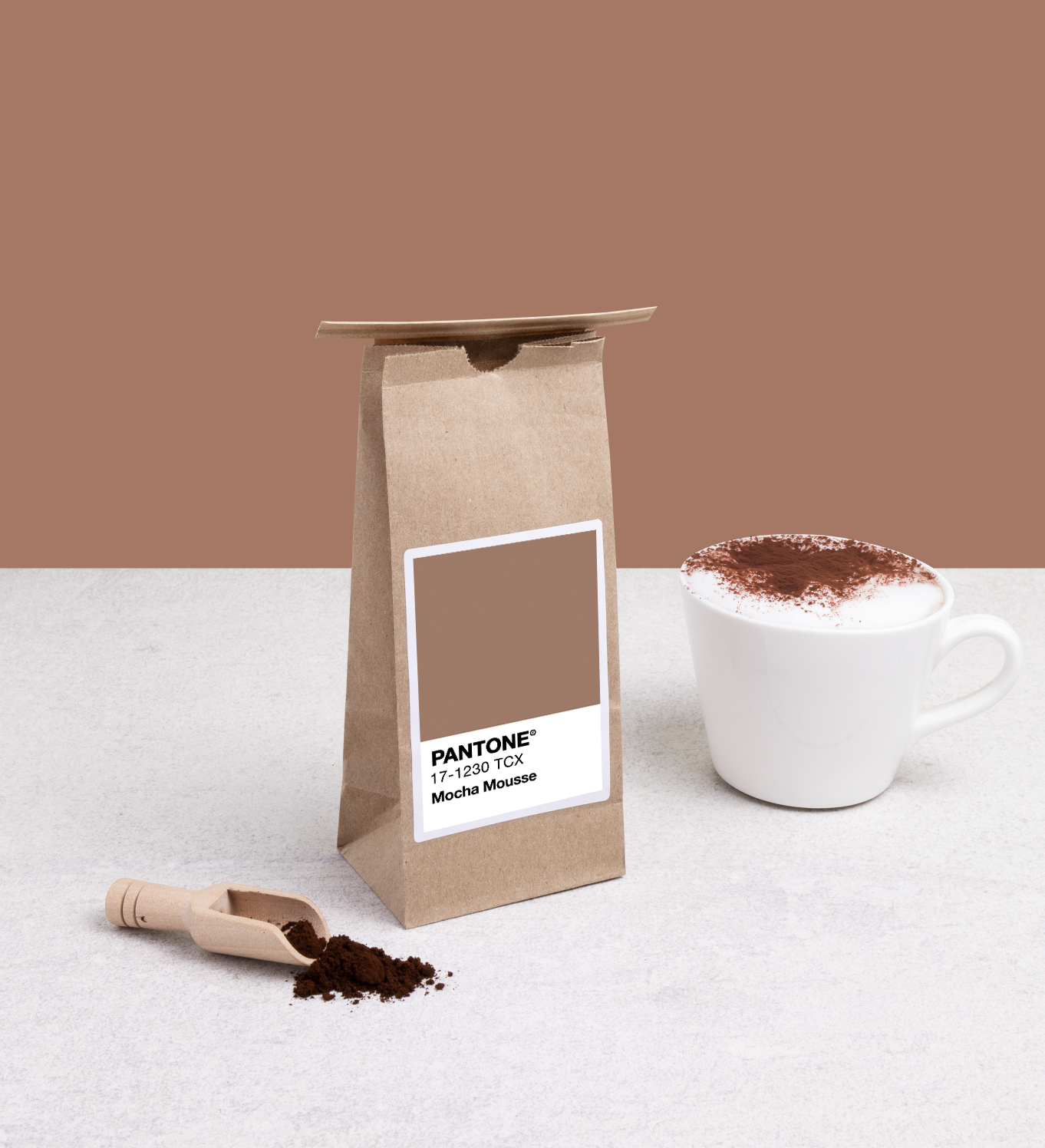
And at the top of the list is Mocha Mousse - the Colour of the Year and an instant classic. It’s rich, chocolatey, and totally wearable (for your brand, your packaging, or maybe even your walls!). But that’s just the beginning. Whether you're into fiery reds, juicy oranges, or soft, dreamy pinks, there’s a shade this summer that’s ready to make your products pop.
Let’s dive into the colours that are setting the tone for summer 2025.
Summer trending colours 2025
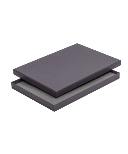
Colour of the Year: Mocha Mousse
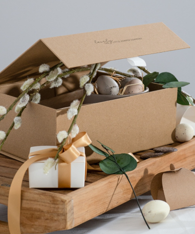
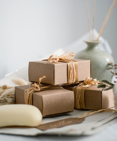
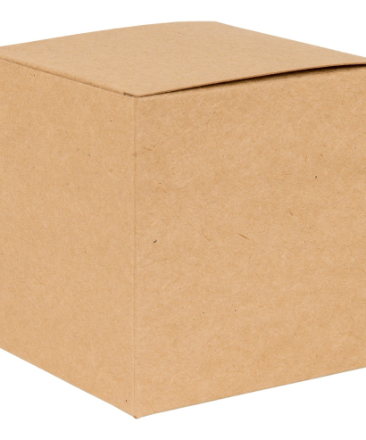
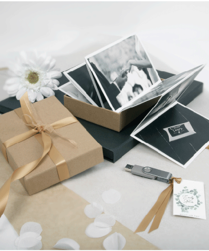
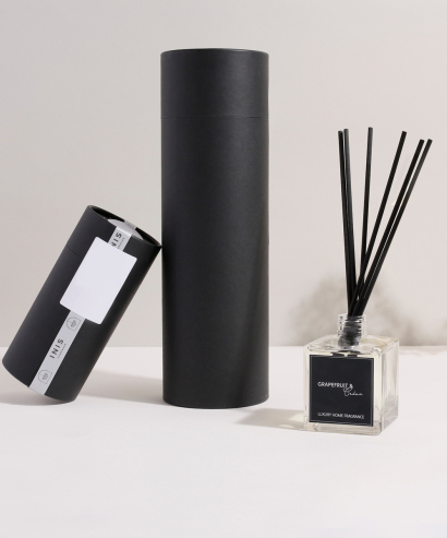
First up, we need to acknowledge the Colour of the Year: the good enough to eat (or drink) Mocha Mousse! This deliciously deep brown is cosy, comforting, and full of depth - so it's a great neutral. It works particularly brilliantly for luxury or eco-conscious lines - think kraft-style boxes, textured labels, or minimalist tins for beauty or home goods.
In fact this year’s trending colours saw a lot of earthy and grounded tones, highlighting how eco-conscious brands and consumers are now. See more below...
Bright and Bold: Red and Orange
Next, we have some classic summer shades - red and orange. These bright colours were also mentioned in our trending colours for 2025, and for good reason, they never go out of style. Red is timeless, conveying a fiery, passionate tone that’s a favourite for a variety of products, particularly when they’re on sale. For summer, it adds instant energy to everything from fizzy drinks to festival flyers.
Then we have orange - also big, bold, and beautiful. It brings with it sunshine, positivity, and tonnes of energy, making it perfect for lots of summer, travel, and kids' products. Think packaging for drinks, snacks, beachwear, toys, etc!
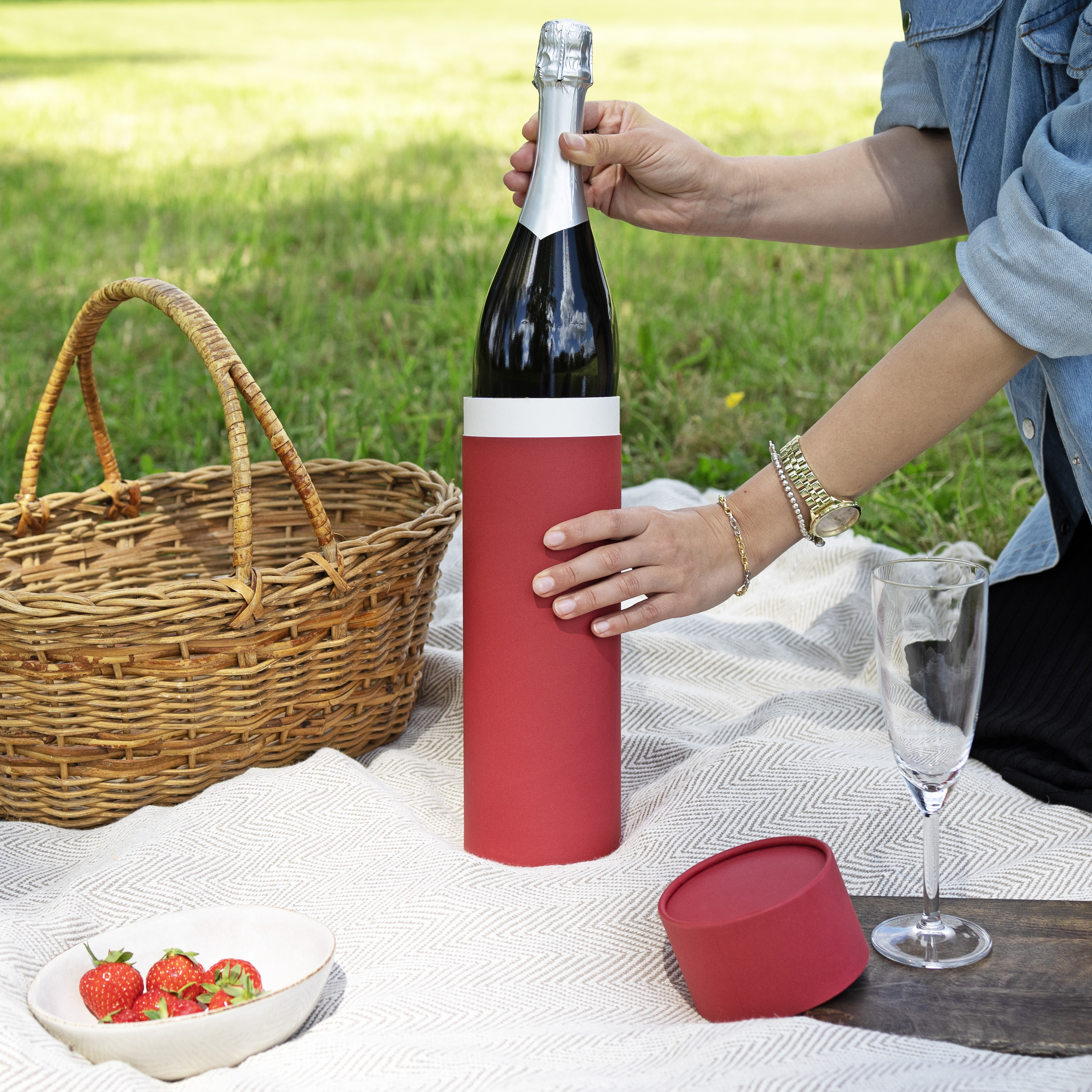
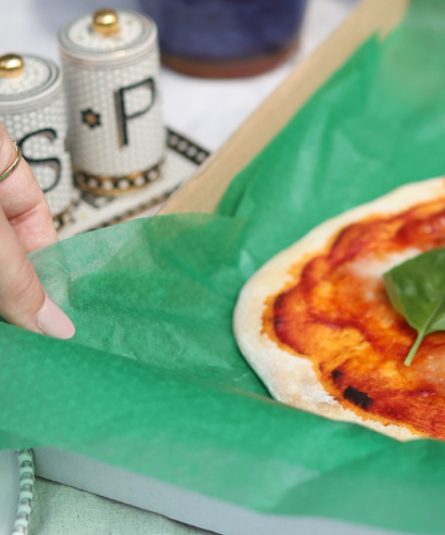
Anyone for a picnic?
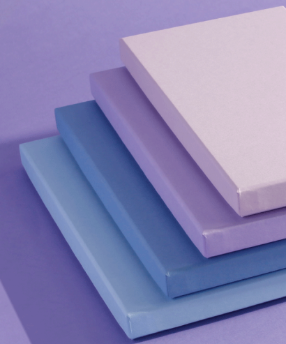
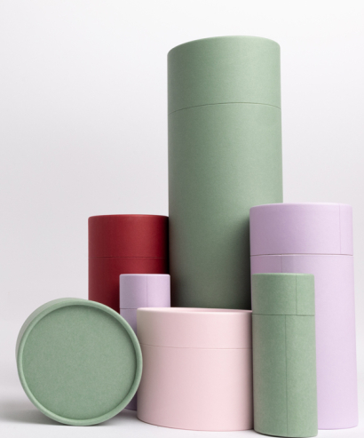
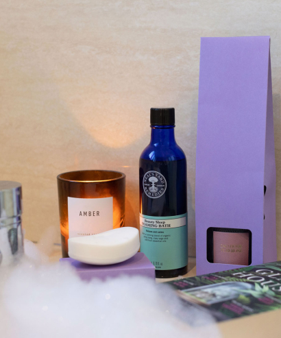
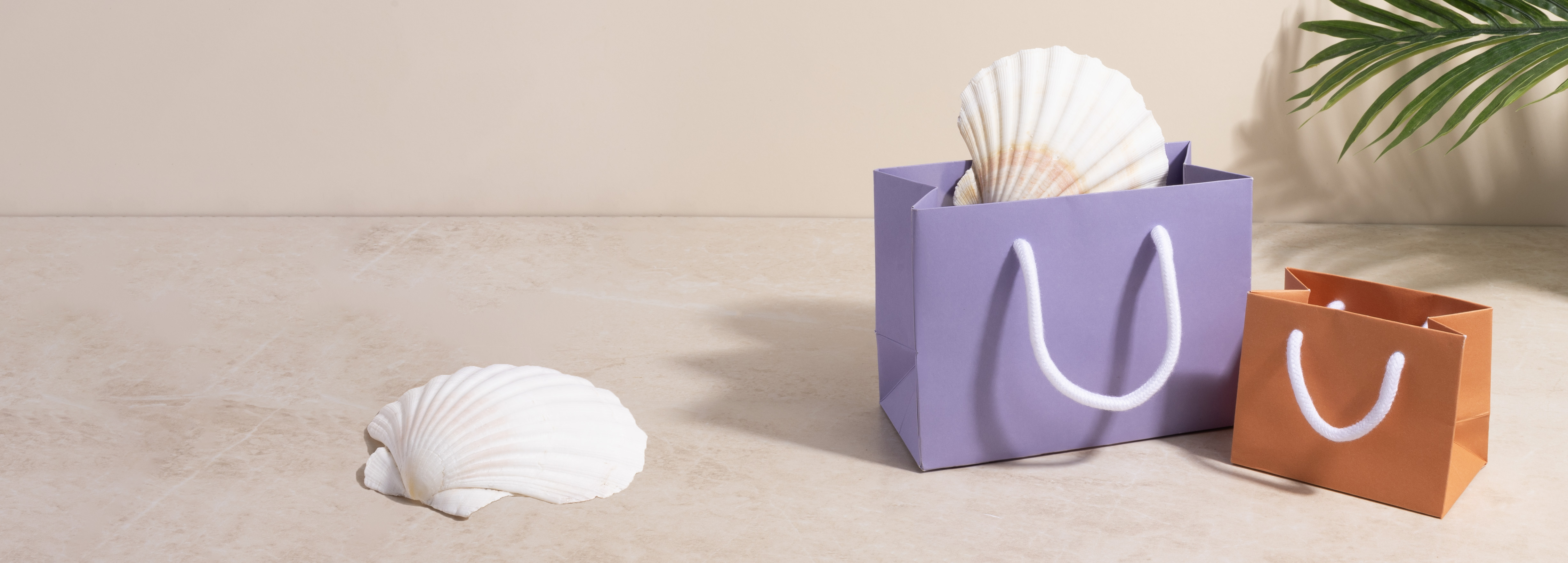
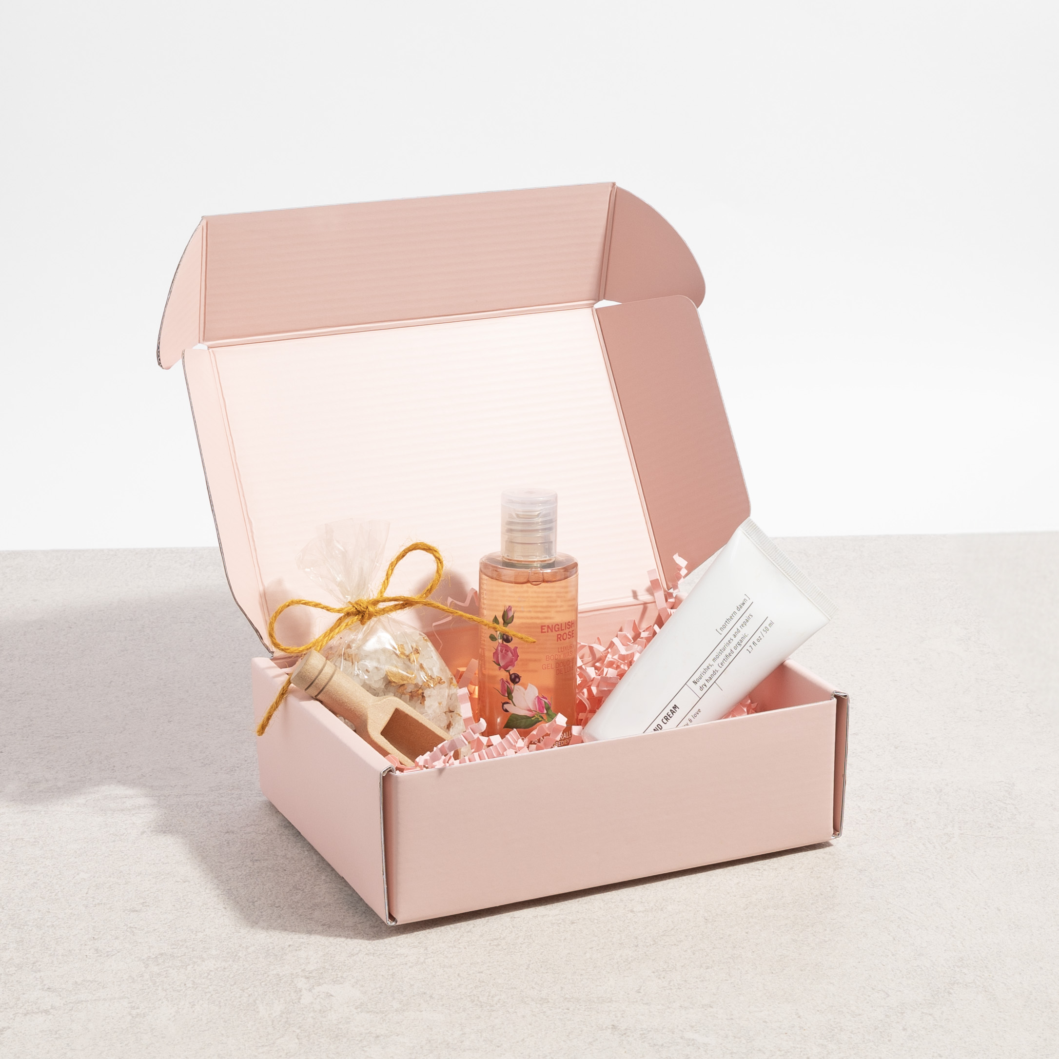
Soft and Pretty: Pink and Purple
Going back to those earthy and grounded tones we mentioned earlier, we have some pink and purple shades that are lighter but still very pretty. Muted pinks, like rose quartz and fondant pink, are soft and feminine (think Glinda from Wicked), making them perfect for anything in the cosmetic, beauty, and wellness category. Or go for some purple tones like lilac and lavender - dreamy, nostalgic and great for anything, from mindfulness products to tech gadgets!
Sunny and Eco-Friendly: Yellow and Green
Next we have some more lovely (and yummy) colours - specifically, yellow and green. Butter yellow is soft, creamy, and brings instant sunshine to just about anything, so it works wonderfully for wellness brands, beauty products, and summer beverages.
Then there’s green (perfect for anyone who’s more Elphaba than Glinda!). Bold and mint greens, for example, are fresh, playful, and again have that clean, eco-conscious energy that consumers are loving right now. Green is especially great for packaging sustainable products, especially when paired with eco-friendly materials like acid-free tissue paper and wood pulp ribbon.
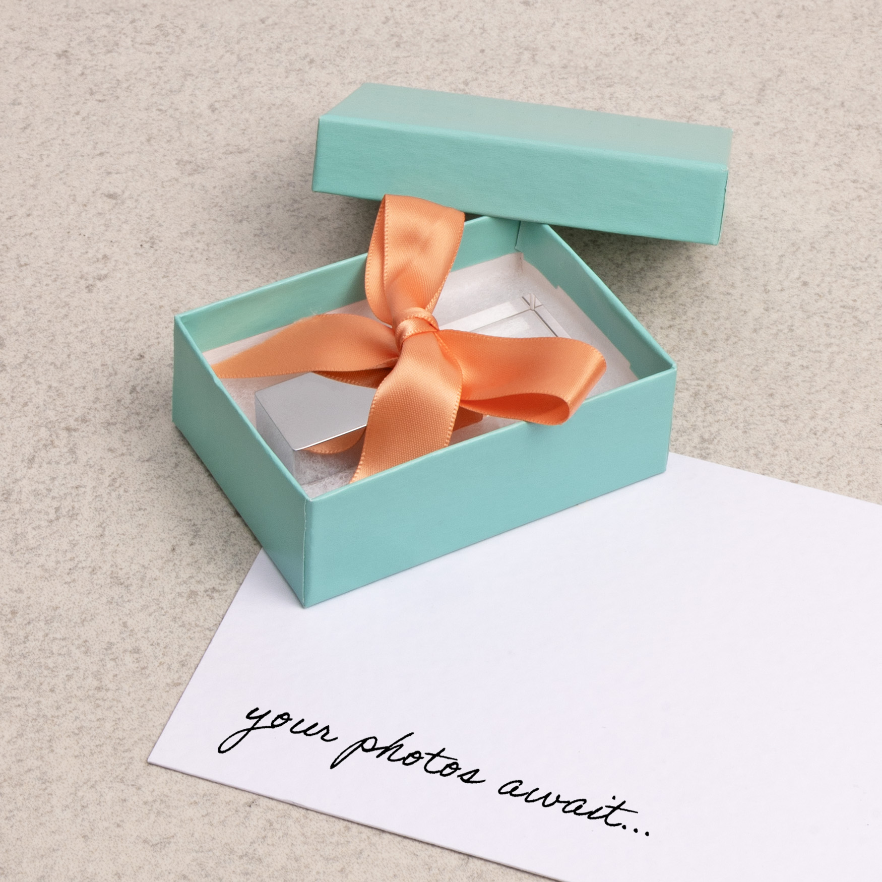
This aqua gift box is made from recycled materials!
How brands can use summer 2025 colours in their packaging
Use colour to signal product categories: For example, Mocha Mousse works brilliantly for luxury or eco-conscious lines - think kraft-style boxes, labels, or minimalist tins for beauty or home goods. Pastels like lilac and fondant pink are perfect for skincare, wellness, or tech accessories, while bright colours like red and orange catch attention fast, making them ideal for seasonal promotions, summer snacks, or kids’ products.
Lean into colour psychology: Green tones communicate sustainability, health, and freshness, making then ideal for plant-based, eco, or natural brands. Yellow and orange spark happiness and energy, so they're perfect for fun-loving food brands or travel-friendly packaging, and purple and pinks evoke calm, femininity, and mindfulness - great for self-care or detox products!
Create summer editions or colour-led campaigns: Why not launch limited-edition packaging using trending colours to align with summer themes? Or, consider colour-blocked designs to visually separate summer collections from the rest of your line, using trending palettes as seasonal signifiers.
Use colour strategically for shelf impact: Brights colours like red and orange draw the eye quickly, ideal for crowded shelves or impulse buys. Earthy tones and soft pastels, on the other hand, can convey premium or clean beauty vibes, especially with matt or uncoated finishes.
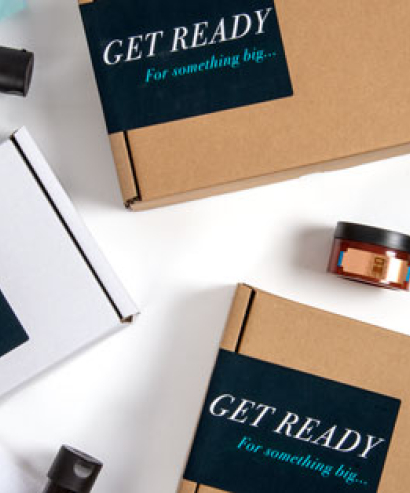
Get Ready For Summer
As you can see summer 2025 packaging is all about joy, nostalgia, and staying eco-friendly. So whether you're riding a bold wave or basking in pastel serenity, there are lots of shades to choose to make you stand out from the crowd!
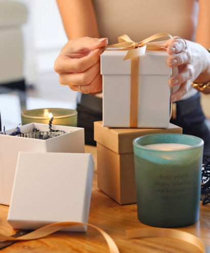
Not ready to abandon your brand colours? No worries! You can add lil touches without a complete overhaul. Think about adding accessories like tissue paper, ribbon, or stickers to give your existing range that lovely summer glow-up.
So, go ahead - make it pop!
